Chad Rubin
May 22, 2026 · 12 min read
Operator notes by email
Short, opinionated takes on AI agents, Amazon PPC, pricing, and inventory. No fluff. About once a week.
Most A+ content on Amazon is built like a brochure. A pretty hero, a few lifestyle photos, a paragraph nobody reads, a logo, done. The brand team feels good. The CVR does not move. Then somebody asks why we spent six weeks on it.
After running a 7-figure Amazon brand for a decade, I have a simple way to think about A+ content. It is not a primary surface. It is not where most buyers decide. It is a CVR lever for the long-tail of comparison shoppers, the ones who scroll past the bullets because the bullets did not close them. Treat the canvas as a copy showcase and you get brochure results.
The shift in 2026: Amazon has quietly pushed Brand Story higher on mobile, the comparison table module shows up in more carousel placements, and the gap between brands treating A+ as decoration versus a conversion surface keeps widening. This is the operator guide. What each module does, where mobile cuts it, how to write for the buyer on the fence, how to measure it, and how to roll it across a multi-ASIN catalog without burning six months.
The detail page is a stack of surfaces, and each one closes a different slice of the buyer pool. Title and hero close impulse and brand-loyal buyers. Price and Prime close price-sensitive buyers. Reviews close trust-sensitive buyers. Bullets close the buyer who reads. By the time someone reaches A+, you have lost the easy sales and kept the hard ones.
That is the slice you are writing for. The comparison shopper with three tabs open, the gift buyer who needs to be sure the box looks right, the technical buyer who wants specs the bullets did not give, the skeptical buyer looking for one reason to leave. The marginal buyer who tips a 12% CVR into a 14% CVR.
From reading to action
If the framework above sounds familiar, your Amazon account is probably carrying the same drag. Apply and we will show what Marko, Oracle, and Bruno would change in your first week.

Ran a 7-figure Amazon brand for a decade. Founded Skubana (acquired). Co-founded Prosper Show. 15+ years on Amazon.
Join the brands that replaced agencies and tools with AI employees.
On desktop, A+ sits below the bullets and above reviews. On mobile, it is interleaved with reviews, comparison widgets, and sponsored placements. Most operators design for desktop and check mobile after. That is backwards. Around 70% of Amazon sessions are mobile depending on category, so mobile is the canonical render. Desktop is the variant.
One more thing: A+ does not help your search ranking in any meaningful way. Amazon does not index A+ image text and the indexing of A+ copy is weak compared to title and bullets. A+ is for the buyer, not the algorithm.
Brand Story and A+ content (the artist formerly known as Enhanced Brand Content) are two different modules with two different placements. Operators conflate them, and it shows up in the layouts.
Brand Story is a single horizontal carousel that sits above the standard A+ block. It is brand-level, not ASIN-level. Build it once for the brand and it inherits across every ASIN unless you override. It shows up earlier in the mobile scroll, so more buyers see it than the A+ block below.
Enhanced Brand Content is the modular block of seven module types you build per ASIN (or per parent ASIN). It is product-level. It is where you handle product-specific objections, comparisons, and specs.
The strategic implication: Brand Story should answer "who is this brand and why should I trust them," and A+ should answer "is this specific product right for me." Most brands flip this. Product features in Brand Story, brand fluff in A+. Then they wonder why neither converts. A Brand Story doing its job sends traffic to your other ASINs via the cross-sell tiles, establishes trust in 3 seconds, and lowers bounce on the long-tail buyer who hit the page from a fringe search term.
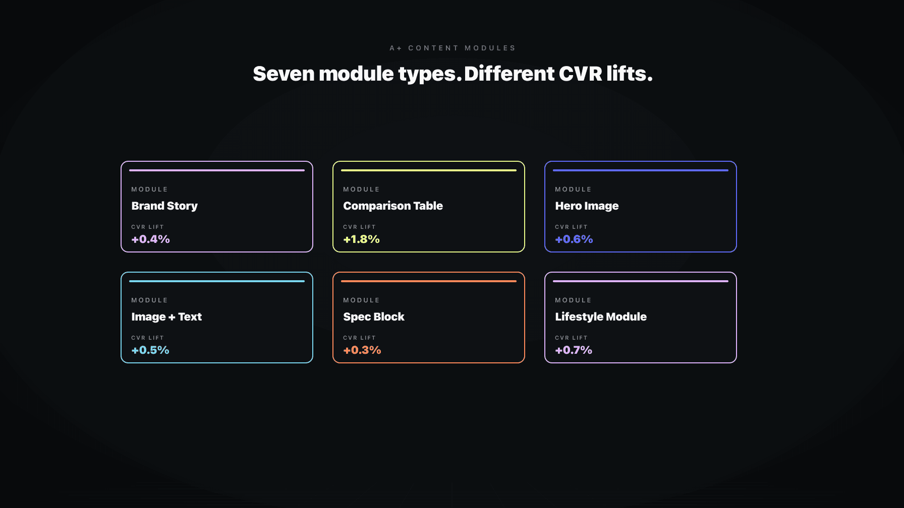
Amazon's A+ module library has expanded over the years, but in practice you are picking from seven workhorses. Each has a job. Picking the wrong module is the most common A+ mistake I see in audits.
Hero with text overlay. Emotional positioning, brand promise restate. Not for product specs. The overlay gets cut on mobile.
Image and dark text. Most flexible module. Use for objection handling, use case demonstration, "how it works" explanations. Renders cleanly on mobile.
Four image and text quadrant. Feature breakdowns where each feature needs equal weight. Four is the cap. If you have more than four features that matter, your product positioning is weak, not your A+.
Image header with text. One specific use case, benefit, or differentiation point. The "make one argument" module.
Comparison chart. The highest-impact module, covered below.
Standard single image. Use sparingly. Mostly for lifestyle context. Almost never as a standalone module.
Multiple image text module. Structured walkthrough, like a setup guide or "what is in the box." Good for technical products, wasted on simple ones.
The pattern: each module has a narrow job. Operators pick modules based on what looks pretty in the editor instead of what closes the buyer on the fence.
The comparison table is the closest thing A+ has to a cheat code, and almost every brand I audit is using it wrong.
Wrong way: list five of your own products in a row, check every box on every product, and pretend each one is best for something. The buyer scans it, sees nothing useful, moves on.
Right way: redirect the wrong-fit buyer to the right-fit ASIN in your catalog. Somebody landed on your 16oz product and needs the 32oz, the comparison table saves that sale. They landed on the basic SKU and wanted the pro SKU, same thing. The comparison table is a routing tool, not a flex.
The other right way: implicit comparisons against competitor configurations without naming them. List the features the competitor lacks, the spec the competitor cheaps out on, the use case the competitor cannot handle. Do not name names (Amazon will reject it). Build a chart where your product checks the boxes that matter and the implicit alternative does not.
A well-built comparison table does two things for CVR: it captures the buyer who would have bought a different SKU in your catalog (margin recovery), and it gives the comparison shopper the structured answer they were looking for elsewhere (decision closure).
Build for desktop, ship to mobile, lose CVR. Here is what mobile does to your A+ content.
Hero text overlays get cut or shrunk to the point of being unreadable. If your hero relies on overlay copy, mobile buyers see a pretty picture and nothing else. Use a separate text module below the hero.
Long paragraphs get truncated with a "Read more" link. Most buyers do not tap it. If your value prop is in paragraph three, it is not in the buyer's head. Lead with the punchline.
Multi-column layouts collapse into stacks. A four-image quadrant becomes four sequential blocks. Plan for the scroll, not the grid. The bottom-right tile in your desktop layout becomes the bottom of a four-screen scroll on mobile.
Comparison tables scroll horizontally on mobile and most buyers do not realize it scrolls. Put your most important columns first. The Pro SKU column should be column two, not column five.
Image quality compresses on mobile and detail gets lost. Avoid fine-print labels inside images. The fix is to design every module with the mobile preview open as the primary canvas, not as a final check.
Voice matters more than the design template. Most A+ copy reads like a hype reel: "Premium quality. Unbeatable performance. Designed for the way you live." The comparison shopper reads that and learns nothing.
Write for the buyer asking "but what about X." X is the objection. Reviews tell you X. Q&A tells you X. Returns tell you X. Support tickets tell you X. If you do not know your top three objections, you cannot write A+ copy that closes anybody.
Once you know the objections, the writing job is mechanical. Each module handles one objection. Module one: "is this big enough." Module two: "will this work with my setup." Module three: "is the build quality real or cheap." Each one is a small argument with evidence (an image, a spec, a use case) and a punchline.
The tone is operator-to-operator, not brand-to-consumer. Specific over vague. "Fits standard 1.5 inch interior diameter hoses" beats "universal fit." "Holds 32oz, enough for a full day" beats "spacious capacity." Specific copy converts because it answers the question the buyer was actually asking.
One more thing on voice: stop selling. The buyer is already on your detail page. They are 80% sold. They need permission, not persuasion. The job is to remove doubt, not add enthusiasm.
The cleanest A+ modules follow a simple ratio: one strong image, one tight headline, one paragraph (three sentences max), one supporting detail. Anything more is cut by mobile or skimmed past.
The hero module can break the ratio because it is setting tone, not arguing a point. There, the image carries everything and the text is decoration. For every other module, the image should make the point visually and the text should reinforce it, not introduce it. If the buyer can understand the module without reading the copy, you have the right balance.
Avoid putting critical information in images. Screen readers cannot parse image text and mobile compression makes fine print unreadable. The image shows the product. The text states the fact.
Headline length matters. On mobile, anything over eight to ten words wraps awkwardly. Write headlines like ad copy: punchy, specific, scannable. "Built for daily use, tested for years" beats "Premium quality construction designed to withstand the rigors of everyday use." Both say the same thing. Only one converts.
The honest version: you cannot cleanly A/B test A+ content on Amazon. Manage Your Experiments supports A+ tests for eligible accounts, but sample sizes are small, splits are leaky, and test windows are short. You get a directional answer, not a clean one.
Even outside MYE, CVR variance on Amazon is brutal. Price changes, competitor price changes, Buy Box loss, inventory health, review velocity, organic ranking shifts, ad spend, seasonality. Any A+ change is one of fifteen variables moving at once.
The way to measure honestly is to triangulate. Cohort comparisons: a group of ASINs you updated against a matched group you did not. Watch session-percentage CVR over a 30 to 60 day window. Hold price flat. Keep ad campaigns stable. Watch for external variance like a competitor going out of stock.
Qualitative signals matter too. Are returns trending down? Are negative reviews citing the same objection less often? Are Q&A questions dropping in volume because the A+ now answers them? Slower but cleaner than CVR deltas alone.
If you need a single number to defend the refresh, use 30-day CVR pre and post, against a matched control set, with price flat. Not bulletproof but defensible.
A+ content is not Instagram. You do not need fresh creative every quarter. Most A+ on most ASINs should sit untouched for six to twelve months.
Update when the product changes (new SKU, new packaging, new feature). Update when the competitor set changes (a new entrant that beats you on a spec means your comparison table is wrong). Update when reviews change (a new objection in the last 90 days that the A+ does not address makes it stale). Update when the buyer changes (new demographic, new geography, new use case driving sales).
Do not update because it has been a year. Do not update because the design team is bored. Module type fads come and go. The buyer is still asking the same questions, unless something material changed.
The cost of an unnecessary update is not just design time. Every change resets the CVR baseline. Change it every quarter and you never get a stable read on what is working.
For brands with more than 20 ASINs, the A+ build is a project management problem more than a creative one. Here is the rollout sequence that scales.
Start with Brand Story. Build it once, it inherits across the entire catalog. Get the brand argument right and every ASIN benefits. Watch the data for 30 days across the catalog, then iterate.
Tier the catalog. Top 20% of ASINs by revenue deserve custom A+ per ASIN. Middle 60% can share a template per category or per parent ASIN. Bottom 20% can run on a minimal A+ block or Brand Story alone. Equal A+ effort across every ASIN is how you burn six months.
Build module libraries, not one-off layouts. Three to five reusable module sets (one for premium SKUs, one for value, one for accessories) lets you assemble new ASIN A+ in hours instead of weeks. The buyer is not comparing your A+ across your catalog. They are comparing it to the competitor's. Internal consistency is fine.
Use parent-child inheritance. If your variations are color or size of the same product, A+ usually inherits from the parent. Build the parent A+ once, let children inherit, override only when a variant has a unique selling point.
Set a review cadence by tier. Top-tier: quarterly review against reviews and Q&A. Mid-tier: semi-annual. Bottom-tier: annual or trigger-based.
Brett is one of the AI employees inside Profasee. He audits Amazon catalogs at the ASIN level and flags listings leaking CVR. A+ content is one of the things he scans for.
The audit checks three things. First, presence: Brett flags every ASIN with no A+ content at all. For most brands above 50 ASINs, that list is longer than expected. The long-tail ASINs are usually the ones missing A+, and those are also where the CVR lift from adding A+ is largest in percentage terms.
Second, module mix. Brett looks at the modules in use and compares them against the category. Consumables convert on different modules than hard goods. Brett flags A+ layouts leaning too heavily on the wrong module type for the category, and recommends the modules that best-converting category listings use.
Third, mobile readiness. Brett scores each A+ block for mobile rendering. Hero overlays getting cut, long paragraphs getting truncated, comparison tables ordered for desktop. Most brands have never looked at this.
The output is not a redesign brief. It is a prioritized list of ASINs ranked by revenue at risk and likely CVR upside, with module recommendations per ASIN. Your design team or agency takes the list and ships the updates. Brett does not write the copy. He tells you which listings need it most.
To see what an A+ audit across your catalog looks like, apply here or check pricing. The full Amazon listing optimization workflow covers titles, images, bullets, and A+ as a single pass. See also variation and parent ASIN strategy and catalog audit triggers.
Amazon A+ content is the enhanced detail page block that brand-registered sellers add below the bullets and above reviews. It is built from a library of module types (hero images, comparison tables, image and text layouts) and replaces the plain product description. Available to sellers in Amazon Brand Registry.
On average yes, but the lift varies by category, by the quality of the listing before A+ was added, and by how well the A+ is built. Amazon's published guidance cites lifts in the 5 to 10% CVR range for adding A+ to listings that had none. Refreshing weak A+ to strong A+ lifts less in percentage terms but still matters at scale.
A+ content is product-level and sits below the bullets. Brand Story is brand-level and sits above A+ as a horizontal carousel. Brand Story inherits across every ASIN and is built once. A+ is built per ASIN (or per parent ASIN). Brand Story handles "who is this brand." A+ handles "is this the right product for me."
The comparison table, used correctly, has the highest CVR impact for most categories. It gives the comparison shopper a structured answer and routes wrong-fit buyers to the right SKU in your catalog instead of losing them to a competitor.
For your top revenue ASINs, yes. For mid-tier ASINs, A+ should exist but can run on a shared template. For long-tail ASINs with low traffic, Brand Story alone can be enough. Tier your catalog by revenue and allocate effort accordingly.
Most A+ should sit untouched for six to twelve months. Update when the product changes, when the competitor set shifts, when reviews surface a new objection, or when the buyer changes. Do not update on a calendar cadence. Unnecessary updates reset your CVR baseline.
AI can draft A+ copy and propose module layouts. It cannot decide which objection your A+ should handle, which module is right for your category, or where in the buyer journey you are leaking CVR. That part is still operator work. Use AI for drafting and assembly. Use operator judgment (or a catalog audit tool like Brett) to decide what to draft and which module to use.