Chad Rubin
May 23, 2026 · 12 min read
Operator notes by email
Short, opinionated takes on AI agents, Amazon PPC, pricing, and inventory. No fluff. About once a week.
Most listing optimization advice still treats images like a checkbox. Seven images, white background, done. That advice is from a desktop era that no longer exists. The shopper you need to win is holding a phone, scrolling fast, and deciding whether to tap your product or the one below it. Images are the only layer of your listing that directly drives both click-through rate from search and conversion rate on the detail page. Title contributes to CTR. Bullets and A+ contribute to CVR. Images do both, at the same time.
I have run Amazon brands for over a decade, and the pattern across catalogs is consistent. Sellers spend weeks on title keyword research, then ship a main image that is unreadable at 100 by 100 pixels. They build out a seven-slot carousel and use all seven slots to show the same angle of the same product on the same white background. That is not conversion work. It is checkbox work.
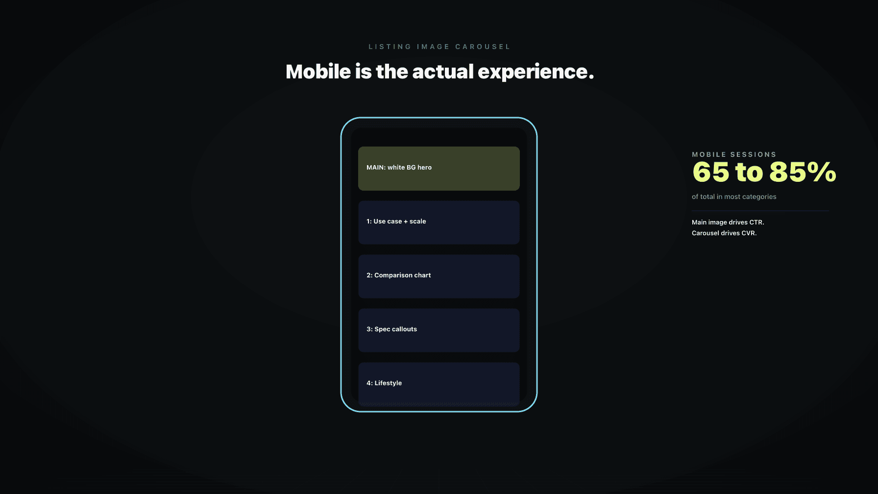
The framework that actually moves the needle splits image strategy into two jobs. Defensive image work is about the main image: thumbnail readability, policy compliance, and not getting suppressed. If you fail here, no one clicks. Offensive image work is about the carousel: every additional slot is a chance to close an objection, demonstrate a use case, or differentiate from the look-alike SKU sitting next to you. If you fail here, you got the click and lost the conversion. This is the playbook I run on my own catalog and built into Profasee Brett, our catalog auditor. The lens throughout is mobile first, because over 70 percent of Amazon traffic is mobile, and the rendering reality on a phone is meaningfully different from what you see in Seller Central preview.
Walk through what a shopper sees on a mobile search results page. A thumbnail. A truncated title (about 60 characters before the cut). A price, a rating, a Prime badge. That is the entire CTR decision. The thumbnail is roughly 40 percent of the visual real estate of each result card, and it is the only element that is not text. In a feed of mostly text, the image is what stops the thumb.
From reading to action
If the framework above sounds familiar, your Amazon account is probably carrying the same drag. Apply and we will show what Marko, Oracle, and Bruno would change in your first week.

Ran a 7-figure Amazon brand for a decade. Founded Skubana (acquired). Co-founded Prosper Show. 15+ years on Amazon.
Join the brands that replaced agencies and tools with AI employees.
Then the click happens. On the detail page, the carousel takes up almost the entire above-the-fold area on mobile. Title sits below. Bullets sit below the buy box, often requiring a tap to expand. A+ content sits even further down. If the shopper is in fast-scroll mode, the carousel is the entire conversion event. They swipe through three or four slots, decide, and either add to cart or bounce.
Images do two jobs that no other listing element does. They are the only CTR lever that is not a keyword, and the only CVR lever that is above the fold on mobile by default. The other reason images outperform copy: copy is increasingly commoditized by AI. Anyone can generate a passable bullet point in 30 seconds. Differentiated images still require a brief, a photographer or a 3D artist, and a point of view about the product. That gap is widening, not closing.
Here is the test I run on every main image before it ships. Export the image at 100 by 100 pixels and look at it on a phone. If you cannot identify the product category in under one second, the image fails. If you cannot tell what color or variant it is, the image fails. If any text or graphic element is now an illegible blur, the image fails.
This is the actual size the thumbnail renders at in Amazon search on mobile. Every dollar of ad spend driving traffic to that listing is filtered through that thumbnail. A main image that is gorgeous at 2000 pixels and unreadable at 100 pixels is a leak that compounds across every campaign you run.
The patterns that survive the 100 by 100 test are predictable. The product fills 80 to 85 percent of the frame. Color contrast against the white background is high. The angle reveals the product's identity (a bottle from three-quarter, not straight on). No thin lines, no small text, no fine textures that turn to noise at low resolution. If you sell variations, the main image for each child ASIN should be visually distinguishable at thumbnail size. A red and a pink variant that look identical at 100 pixels are a CTR problem and a returns problem.
The main image policy is strict and the enforcement has gotten more aggressive. Pure white background (RGB 255, 255, 255). Product fills the frame. No text, logos, watermarks, or graphics on the main image. No props, no accessories that are not in the package, no human models unless the product is apparel. No borders, no color blocks, no badges like "best seller" or "made in USA" baked into the image.
The dangerous failure mode is silent suppression. Amazon does not always tell you the listing is suppressed because of an image issue. The listing stops showing in search, traffic drops, and ad ROAS collapses. By the time anyone notices, you have lost a week of sales and possibly your organic rank. The most common silent flags I see in audits: a faint logo or brand mark baked into the corner, a small "new" graphic from a launch six months ago, a multi-pack indicator that includes text, or a background that is slightly off-white instead of pure 255.
The other defensive layer is image resolution. Amazon recommends 2000 pixels on the longest side for zoom. Sub-1600 pixel images disable zoom, and on a detail page where the shopper wants to see a label or a spec, no zoom is a conversion killer.
Once defense is handled, the carousel is where conversion is won or lost. Amazon allows up to seven images plus a video in most categories. On mobile, the carousel is what the shopper sees above the fold, and the swipe pattern is fast. You have maybe three slots of attention before they decide.
The mistake I see most often: sellers treat the carousel as a photo gallery. Seven angles of the same product. That is not selling. That is documenting. A carousel that converts treats each slot as a discrete answer to a specific objection.
The mental model: the shopper has questions they need answered before they buy. How big is it? How do I use it? Why is it better than the competitor I just looked at? Is it for me? Each carousel slot should answer one of those, in a single glance. If your competitor has seven slots of product on white and you have one product-on-white slot plus six slots of use-cases, comparison charts, and lifestyle context, you are not in the same fight. They are documenting. You are selling.
This is the framework I use, and it is what Brett applies when auditing a catalog. Slot 1 is your main image and it is defensive. Skip it for this section. Slots 2 through 7 are offensive.
Slot 2: Scale. Show the product next to something familiar. A hand, a coffee cup, a piece of furniture. The single biggest CVR killer on Amazon is a shopper guessing at size.
Slot 3: Use. Show the product being used in the exact context it was designed for. Not a brand mood shot. A specific moment of use. The shopper should see themselves in it.
Slot 4: Comparison or differentiation. A side-by-side with a worse alternative (without naming the competitor), or a feature callout showing what makes your version different. This closes the "why this one" question.
Slot 5: Spec or infographic. Materials, dimensions, what is in the box, compatibility. Replaces the bullets for the 80 percent of shoppers who never read bullets on mobile.
Slot 6: Lifestyle or aspirational. The product in a beautifully styled environment. The emotional close.
Slot 7: Social proof or trust. Awards, certifications, guarantees, founder note, or a customer quote rendered as a graphic.
Not every product needs every slot. The principle: every slot has a job, and if it does not have a job, remove it.
The answer depends on category dynamics. Comparison images win in categories where the buyer is rational and informed: tools, electronics, supplements, anything with measurable specs. Lifestyle images win in categories where the buyer is emotional or aspirational: home decor, apparel, beauty, baby.
The mistake is doing only one. Even a rational category benefits from one lifestyle slot to humanize the brand. Even an aspirational category benefits from one comparison or spec slot to close the rational objection. Order on mobile matters: the carousel is swiped left to right and most shoppers do not swipe past slot 4. Put your strongest slot for your category type in position 2 or 3. If you do not know which type your category is, look at the top three best sellers in your search term and match the dominant pattern, then differentiate within it.
Bullets are dying on mobile. They are collapsed by default, they get truncated, and a meaningful percentage of shoppers never expand them. The information has to live somewhere, and the carousel is where it goes.
The rule for infographic slots: one idea per slot. If you cram four features, three specs, and a comparison into a single graphic, none of it gets read. Pick the single most important piece of information that is not communicated by the product photo, and design the slot around that one thing.
Typography on infographic slots needs to survive mobile. Minimum body text size of about 30 pixels in the source file (at a 2000 by 2000 export). High contrast. Limited color palette. One headline, one supporting line, one visual. The most under-used infographic type is "what is in the box." For any product with multiple components or accessories, a clear visual of everything included reduces returns and pre-purchase questions. Returns are silent CVR killers because they hurt Buy Box eligibility and category rank.
Video is now in the main carousel for most categories, not just A+ content. It auto-plays muted on the detail page, so the first three seconds do the work whether the shopper hits play or not.
Video moves CVR when it shows function: the product being assembled, used, demonstrated, or compared in motion. A 20-second clip of someone actually using the product converts. Video does not move CVR when it is a brand sizzle reel. Slow-motion logo reveals, ambient music, beauty shots: this is brand work that belongs on social, not on the detail page. The shopper has already decided they might want the product. They want to see it work.
Length matters. Under 30 seconds is the target. The biggest miss I see: no captions. Video auto-plays muted, so if your demonstration requires sound, it is silent for the shopper. Caption every key beat.
Seller Central preview is desktop. The shopper is on mobile. Assuming what you see in preview is what the shopper sees is one of the most common mistakes in image production.
On mobile, the carousel is roughly square in the visible area. Compose with the assumption that the bottom 15 to 20 percent may be de-emphasized or partially covered by UI elements depending on the phone. Critical information goes in the top two-thirds. Text overlays that look balanced on desktop preview often render too small on mobile. The fix: design at the actual mobile size first. Export, view on your phone at carousel size, then judge readability. Variation swatches render at very small sizes in the variation selector. The same 100 by 100 test applies.
Image testing is where most sellers either skip it or do it carelessly and tank their rank. The careful way:
Use Manage Your Experiments inside Brand Registry where available. It is built for A/B testing main images and A+ content and it preserves organic rank by serving variants without changing the listing. For carousel slot testing outside of MYE, the rule is one change at a time and a documented rollback. Swap one slot, hold for a defined window (two weeks minimum, longer for low-velocity ASINs), and measure session-to-purchase rate, not just orders. Never test the main image and the title at the same time. Hold all other variables constant.
The metric is unit session percentage. Sessions, glance views, and units ordered together tell the story. If sessions hold and units go up, the image change worked. If sessions drop and units stay flat, you broke CTR even if conversion looks fine. Both halves matter.
Brett is the catalog auditor inside Profasee. Image work is one of the things Brett audits on every ASIN, continuously.
Defensive scan. Brett checks every main image against current Amazon image policy, flags resolution below the zoom threshold, identifies main images that fail readability at thumbnail size, and surfaces ASINs at risk of silent suppression. Policy drift gets caught before it costs sales.
Carousel slot audit. For every ASIN, Brett identifies which slot types are present (scale, use, comparison, spec, lifestyle, social proof) and which are missing. ASINs missing high-leverage slots get flagged with an estimated CTR or CVR impact based on the category and the existing performance baseline.
Image stack proposals. Where slots are missing or weak, Brett proposes a specific image to produce, with a brief, a job-to-be-done, and an estimated impact. Proposals are prioritized by velocity, so the ASINs driving the most revenue get the carousel rebuild first.
Test management. When images are swapped, Brett tracks the change, holds it against the documented test window, and reports on whether the change moved unit session percentage. If it underperforms, Brett surfaces the rollback recommendation.
Brett does not replace a photographer or a brand team. Brett tells you which 20 ASINs in your catalog of 200 are leaving the most money on the table with their current image stack, and what specifically to fix first. See how it fits in the broader framework at Profasee Brett, the catalog auditor, or read about the broader listing optimization solution. Pricing is here, or apply to work with us.
The best main image is the one that passes the 100 by 100 pixel readability test, fills 80 to 85 percent of the frame on a pure white background, and uses an angle that immediately communicates what the product is. Test it on your phone at thumbnail size before shipping. If you cannot identify category, variant, and value proposition in one second at 100 pixels, the image will lose CTR in search.
Use every slot Amazon gives you, which is typically seven images plus a video. The number is not the point. What matters is that each slot has a distinct job: scale, use, comparison, spec, lifestyle, social proof. A seven-image carousel of the same product on white is worse than a four-image carousel where each slot answers a different shopper question.
Yes, when the video shows function. A short clip (under 30 seconds) of the product being used, assembled, or compared in motion lifts conversion on most categories. Brand sizzle reels and ambient beauty shots do not move CVR on the detail page. The first three seconds auto-play muted, so design for that and caption every key beat.
Use 2000 pixels on the longest side as the source file. This enables hover-zoom on desktop and pinch-zoom on mobile, both of which are conversion features for any product where the shopper needs to inspect a label, a texture, or a detail. Below 1600 pixels, zoom is disabled and conversion suffers on inspection-heavy categories.
The main image must be product on pure white per Amazon policy in most categories. Lifestyle goes in the carousel, typically in slot 6. Where the policy allows more flexibility (apparel, some home categories), product on white still tends to win CTR in search because it stands out from the lifestyle imagery competitors are running.
Use Manage Your Experiments inside Brand Registry where available. It preserves organic rank by serving variants without changing the listing. Outside of MYE, test one change at a time, hold for at least two weeks, measure unit session percentage (not just orders), and have a documented rollback if the test underperforms. Never test images and title at the same time.
The most common silent suppressions: a non-white background (must be RGB 255, 255, 255), text or graphics on the main image (logos, badges, "new" callouts), props or accessories not included with the product, image resolution too low, or a watermark. Amazon often does not flag these explicitly. The listing just stops appearing in search. Audit the main image against current policy when traffic drops without an obvious cause.